
Saturday, February 26, 2011
BP # 7
According to Debotton there is a such thing as an architecture of happiness. I believe that architecture of happiness varies depending on the person and their personality. To me, an architecture of happiness would be defined as a place to relax and escape the "stresses" of life; a place that I feel comfortable in and reflects the beauty of nature. In class, we discussed the Eastern and Western rule book. For them comfort and relaxation was expressed through harmony and order in all things. By having a place that was unified and in order they could relax because they had an escape from the chaos of the outside world (inner peace). They emphasized spiritual connections through ornamentation which also provided them with the sense of comfort and protection; by including their family's history and ideals they gained a sense of comfort that can be understood by all (family is like a security blanket). Their view on expansion was appreciating and celebrating the little things and seeing the value in them which is what a happy space is all about; the small things in life that give us joy. Looking at a small area may not seem like much but once you open up your mind to see the little things it possesses, then you can appreciate every little detail and that makes you happy with that particular space or place.
One place that I love to visit in my down time is the circular stacks area behind the dining halls. I always go sit outside when the sun is shining brightly and the air is gently flowing. The temperature is just right; it's not too hot nor cold. I go to enjoy a study session or just eat and talk with my friends and it brings a sense of joy and comfort. It's so relaxing to observe other people laughing, dancing, or just walking by with their dogs. You can really see the joy in everyone enjoying time with friends and it's such a wonderful sight. Also, you're able to experience the beauty of nature in all the different trees, and squirrels running around playing and even the sound of the fountain flowing.
 *Continue to layer groves and stacks - stairs and sitting/performing area is all stacked.
*Strive for harmony + order in all things - the whole structure is unified in stacks and material; very balanced.
*Place community needs before your own - I feel this place was designed for the pleasure of the students; for them to hang out and perform events.
*Emphasize surface through materiality - The center circles are the main attraction of this structure therefore, they are in the middle, and circular whereas, it's rectangular on both sides. And also, the center contains a fountain and the tops are covered with the brick (sides covered by grass).
My favorite space on campus is the large tree with the tree swing inside. Although, I never swing on the tire it's a really nice space to go to just to get away from the "stresses" of college and catch up on quality alone time on a nice day. It's quiet, so if you wanted to read a book or just enjoy a nice, quiet afternoon by yourself (surrounded by nature) it's the perfect space for it.


*Continue to layer groves and stacks - On the inside the tree branches create a stacked/layer look.
*Emphasize surface through materiality - The bottom is all dirt and you can sit higher up on the branches; I think this shows difference in the space through materiality. In addition, it's surrounded by leaves.
*Place man at the center - This is shown through the branches in the center that has a tire swing connected.
*Strive for position through patronage - This tree shows that because not only is it tall it's also, wide and bush-like which makes it more more noticeable than your average tree.
One place that I love to visit in my down time is the circular stacks area behind the dining halls. I always go sit outside when the sun is shining brightly and the air is gently flowing. The temperature is just right; it's not too hot nor cold. I go to enjoy a study session or just eat and talk with my friends and it brings a sense of joy and comfort. It's so relaxing to observe other people laughing, dancing, or just walking by with their dogs. You can really see the joy in everyone enjoying time with friends and it's such a wonderful sight. Also, you're able to experience the beauty of nature in all the different trees, and squirrels running around playing and even the sound of the fountain flowing.

*Strive for harmony + order in all things - the whole structure is unified in stacks and material; very balanced.
*Place community needs before your own - I feel this place was designed for the pleasure of the students; for them to hang out and perform events.
*Emphasize surface through materiality - The center circles are the main attraction of this structure therefore, they are in the middle, and circular whereas, it's rectangular on both sides. And also, the center contains a fountain and the tops are covered with the brick (sides covered by grass).
My favorite space on campus is the large tree with the tree swing inside. Although, I never swing on the tire it's a really nice space to go to just to get away from the "stresses" of college and catch up on quality alone time on a nice day. It's quiet, so if you wanted to read a book or just enjoy a nice, quiet afternoon by yourself (surrounded by nature) it's the perfect space for it.


*Continue to layer groves and stacks - On the inside the tree branches create a stacked/layer look.
*Emphasize surface through materiality - The bottom is all dirt and you can sit higher up on the branches; I think this shows difference in the space through materiality. In addition, it's surrounded by leaves.
*Place man at the center - This is shown through the branches in the center that has a tire swing connected.
*Strive for position through patronage - This tree shows that because not only is it tall it's also, wide and bush-like which makes it more more noticeable than your average tree.
Sunday, February 20, 2011

BP # 6
For the most part the two cathedrals (Amiens and Cologne) were similarly designed, but they differed in detail based on their specific location. During this time period the so-called "Dark Ages" many structural changes were brought forth, mainly due to the fact that many people wanted to get out of the "dark" and bring forth the "light". This was achieved by creating a specific blueprint for how the Gothic Church was to be laid out, which included large windows that stretched from the bottom to the top to allow the highest ratio of sunlight in as possible. The blueprint was designed in measurement of man and Heaven and inspired by Noah's Ark which was 50 x 30 ft. encoded in the central space. Further emphasizing the higher power the central space was created in the shape of a crucifix and many scenes of the holy divinity and sacred happenings are implanted into the walls of the cathedrals.
Although, each church built at this time used this same basic layout (taken from the Holy book) to represent the divine in order to open up a way straight to Heaven, each country or region had its own interpretation of ornamentation in an attempt to make their cathedral stand out. For example, Amiens Cathedral, located in France, is known for having buildings with two towers. On the other hand, Cologne Cathedral was located in Germany, which was noted for including only one tower in its structures. Furthermore, in Amiens Cathedral the clerestory windows consisted of more panels which were more narrow in size than the windows in the Cologne Cathedral. Also, the rods at the top of Cologne are not able to be seen whereas, in Amiens they are clearly visible. This is thought to be an advancement in the architecture, due to trial and error, since Cologne is the newer of the two. Continuing with the differences, Amiens appears to have more detail in the interior (seen in the golden section) and Cologne is more detailed on the exterior (seen in the outside figures as well as, the flying buttresses). The cathedrals were built utilizing the technology and resources they had available (which differed based on location and region) because of this many architects faced issues of towers being too big or small and not having enough support. This problem caused towers and buttresses to bend and buckle.


Although, each church built at this time used this same basic layout (taken from the Holy book) to represent the divine in order to open up a way straight to Heaven, each country or region had its own interpretation of ornamentation in an attempt to make their cathedral stand out. For example, Amiens Cathedral, located in France, is known for having buildings with two towers. On the other hand, Cologne Cathedral was located in Germany, which was noted for including only one tower in its structures. Furthermore, in Amiens Cathedral the clerestory windows consisted of more panels which were more narrow in size than the windows in the Cologne Cathedral. Also, the rods at the top of Cologne are not able to be seen whereas, in Amiens they are clearly visible. This is thought to be an advancement in the architecture, due to trial and error, since Cologne is the newer of the two. Continuing with the differences, Amiens appears to have more detail in the interior (seen in the golden section) and Cologne is more detailed on the exterior (seen in the outside figures as well as, the flying buttresses). The cathedrals were built utilizing the technology and resources they had available (which differed based on location and region) because of this many architects faced issues of towers being too big or small and not having enough support. This problem caused towers and buttresses to bend and buckle.


RR # 3

Created and posted when due, but just realized this weekend that I had accidentally deleted it earlier in.
Reading: Ching- p. 150-228
Tuesday, February 15, 2011
US #1
Week 1 -
We looked at examples from Stonehenge and Giza. We talked about Stonehenge; mainly about the circle and how the circle represented equality because it's equidistant from the center, no matter where you stand. Also, how you can be on the inside of the outside of a circle and moving one piece can make it structurally weak. We also discussed Egypt, the first recorded civilization, and how it represented hierarchy. The east = rising of the sun and the west = the setting of the sun. Then you have the sun god at the top and slaves at the bottom. Egyptians believed in an afterlife and therefore, when they died they were buried with all of their belongings. *Heliopolis = the city of the sun. In Egypt size mattered; they aimed for bigger because in their eyes bigger was better and they wanted to be better than others.
Week 2 -
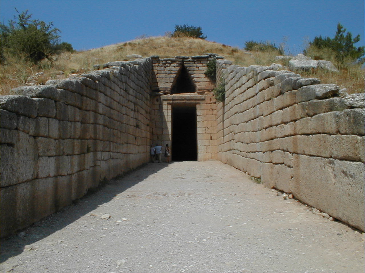
We discussed circles which represented the sun, moon, stars and scared spots. Groups which were represented by groves of trees, reaching vertical and groups of people. Also, stacks symbolized by mountains, stairs and gathering people. And people emulated the human body. We looked at examples from Hatshepsut, Giza and the Sphinx, as well as others. We discussed the prototypes, archetypes, and hybrids of each category. Later, we talked about the elements and principles together and how repetition leads to contrast + emphasis, unity + harmony and balance + proportion. Circles - create a sense of equality; no matter where you are standing and represent balance. Groups - create a pathway; you can sense where to go by the line up. The repetition of groups of objects create unity and a sense of solidity. Stacks - create a sense of visual hierarchy, the higher up you are upon the stack, the more powerful you seem. *Treasury of Atreus - all elements come together.
Week 3 -
This week we discussed groves + stacks together in temples and palaces.
Key components in each building:
Order = arrangement, type, style
Proportion = the relationship, ratio, relative importance, and balance.
We also expanded on the idea of prototypes, archetypes, and hybrids in the world of columns.
Different types of building columns:
[Tuscan] = prototype
Doric = archetype
Ionic = archetype
Corinthian = archetype
Composite = hybrid
The main building was the Acropolis [the megaron contains a porch, court and a hearth]. In the Acropolis the Parthenon = the hearth. The Propylaia = the porch. It contains columns that basically tell you where to go; the entrance way. The Erectheion is the porch of the Madiens, it marks the sacred spot where Zeus' trident hit the ground. Its contains ionic columns and the whole structure itself has no clarity in the design, but tells a story. All of the design aspects used in the Acropolis can be seen in other structures, as it is the main model for buildings following.
Week 4 -
"The end is to build well. Well building hath 3 conditions: firmness, commodity, and delight." - Sir Henry Wotton. The things we talked about this week can be summarized by that one quote. We reviewed Rome and its various buildings and how it was an archetype for "well building". people.
We looked at examples from Stonehenge and Giza. We talked about Stonehenge; mainly about the circle and how the circle represented equality because it's equidistant from the center, no matter where you stand. Also, how you can be on the inside of the outside of a circle and moving one piece can make it structurally weak. We also discussed Egypt, the first recorded civilization, and how it represented hierarchy. The east = rising of the sun and the west = the setting of the sun. Then you have the sun god at the top and slaves at the bottom. Egyptians believed in an afterlife and therefore, when they died they were buried with all of their belongings. *Heliopolis = the city of the sun. In Egypt size mattered; they aimed for bigger because in their eyes bigger was better and they wanted to be better than others.
 |
| Stonehenge |
Week 2 -
We discussed circles which represented the sun, moon, stars and scared spots. Groups which were represented by groves of trees, reaching vertical and groups of people. Also, stacks symbolized by mountains, stairs and gathering people. And people emulated the human body. We looked at examples from Hatshepsut, Giza and the Sphinx, as well as others. We discussed the prototypes, archetypes, and hybrids of each category. Later, we talked about the elements and principles together and how repetition leads to contrast + emphasis, unity + harmony and balance + proportion. Circles - create a sense of equality; no matter where you are standing and represent balance. Groups - create a pathway; you can sense where to go by the line up. The repetition of groups of objects create unity and a sense of solidity. Stacks - create a sense of visual hierarchy, the higher up you are upon the stack, the more powerful you seem. *Treasury of Atreus - all elements come together.
 |
| Treasury of Atreus |
This week we discussed groves + stacks together in temples and palaces.
Key components in each building:
Order = arrangement, type, style
Proportion = the relationship, ratio, relative importance, and balance.
We also expanded on the idea of prototypes, archetypes, and hybrids in the world of columns.
Different types of building columns:
[Tuscan] = prototype
Doric = archetype
Ionic = archetype
Corinthian = archetype
Composite = hybrid
The main building was the Acropolis [the megaron contains a porch, court and a hearth]. In the Acropolis the Parthenon = the hearth. The Propylaia = the porch. It contains columns that basically tell you where to go; the entrance way. The Erectheion is the porch of the Madiens, it marks the sacred spot where Zeus' trident hit the ground. Its contains ionic columns and the whole structure itself has no clarity in the design, but tells a story. All of the design aspects used in the Acropolis can be seen in other structures, as it is the main model for buildings following.
 |
| The Acropolis |
"The end is to build well. Well building hath 3 conditions: firmness, commodity, and delight." - Sir Henry Wotton. The things we talked about this week can be summarized by that one quote. We reviewed Rome and its various buildings and how it was an archetype for "well building". people.
Buildings and Structures: what they meant for the city.
*Road/street = all roads lead to Rome.
*Baths = architecture and ritual
*Temple = adaptation and frontal orientation
*Arch = memorialization
*Market = edge
*Forum = major open space
*Amphitheater = atop the landscape rather than on it
*Colosseum = bread & circuses
*Dome = bringing the world under one roof
Planning was done with roads and streets. The city grid was a universal treatment and varied at the local level. Water was the most marvelous feature of all; it worked its way throughout the city and was displayed all over (cost much money to do this). One notable example, in Rome, Italy everyone used the same bath area, but at different times of the day. It was a vast open space that stood 221 feet tall. The color was highly polychromatic and the interior was much more polished.
*Arch of Constantine - the arches told stories and marked victory for the Romans.
*Colosseum - incorporated the Doric, Ionic and Corinthian columns for honoring its ancestors. The circle is the vertical to the center and implies that what takes place in that center is highly important. The Pantheon contains seven alters that make up the seven order of Roman Gods. Each alter was hollow to allow for a greater area span that using solid tiles. Also, contains an acculeous (open circle at the top) that allows light to travel through the building.
 | ||||
| Roman Bath |
Sunday, February 13, 2011
RR # 5
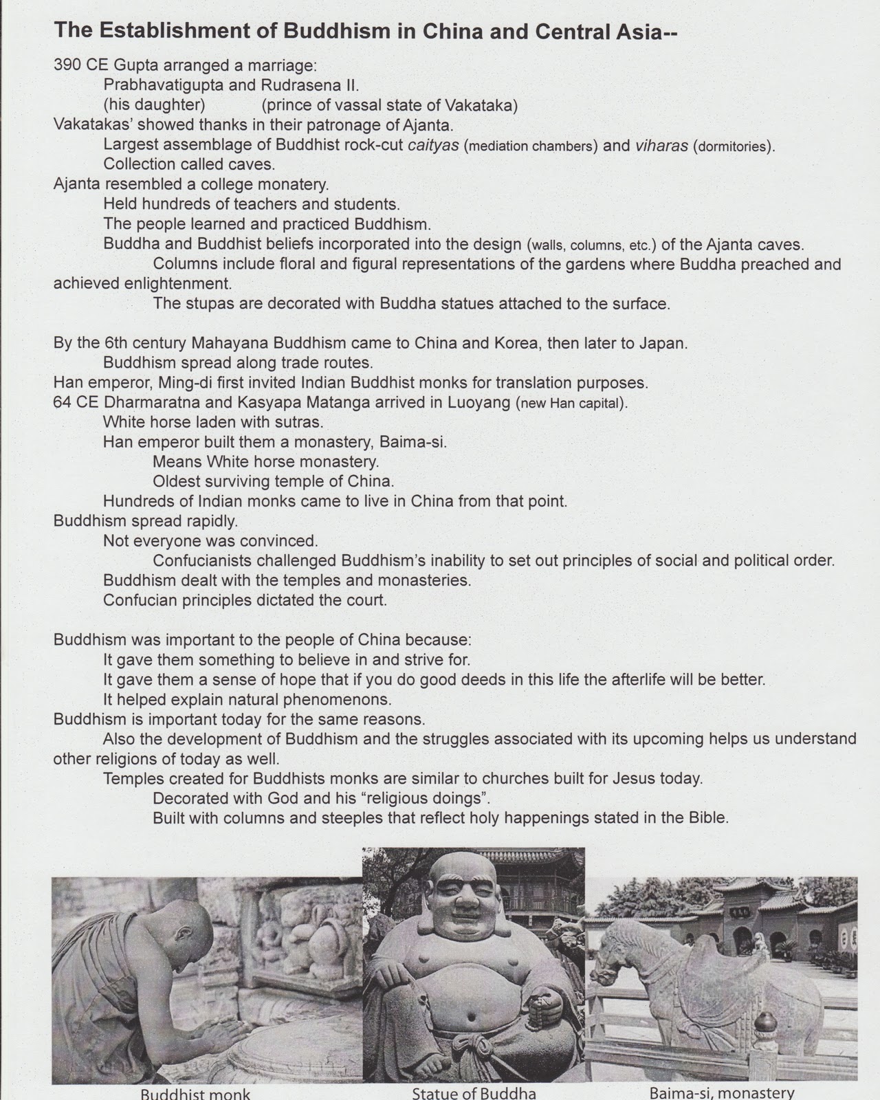
The spread of Buddhism and Buddhist temple decorations reflect how decorations are inside churches and temples today.
Reading: Ching - p. 231-292

Reading: Ching - p. 231-292
BP # 5
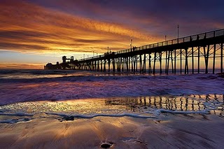
Beauty sets as the day disappears,
The colors in the sky reflect into the water below.
Unity is created, and the waves leave behind ripples of texture;
Composing a flow of layers as far as the eye can see.
The pier pierces through,
Its darkness creates a sharp contrast,
And splits the harmony of the colors above and below.
Monday, February 7, 2011
RR # 4
The Founding of [Rome] Roman Architecture –
 |
| Map of Roman Empire |
· 1000 B.C.E Balkan settlers moved into the Italian peninsula.
300 years later Etruscans moved into Tuscany.
300 years later Etruscans moved into Tuscany.
· Rome’s rule stretched from Gibraltar to Gaul.
· 46 B.C.E Julius Caesar became dictator.
o Assassinated and nephew Octavian took rule.
· Octavian defeated and claimed Egypt.
Began to fall apart during the reign of Marcus Aurelius.
Empire came together once more during the rule of Constantine in 324 C.E.
· An architecture of space (internal and outdoor) to a large extent.
· The essence of Roman architecture was to intentionally shape public spaces.
o The Pantheon – had a span of 142.5 feet.
o Best symbolizes the Roman enclosure of space and the powerful effect.
o Temple to all the gods.
o Included a dome to symbolize the universe.
· The basilica was designed to include a space large enough to hold legal matters and fit a vast amount of people.
o Internal encircling colonnade with an apse, where the judges would sit.
o At the geometric center of the apse was an alter for the emperor.
· Basilica Ulpia measured 385 by 182 feet (not including the apses).
· The Basilica of Maxentius , begun in 307 C.E., was finished by Constantine in c. 325
o Public bath constructed of concrete.
o Circulation space measured 265 by 83 feet.
o Included 3 huge groin vaults and 3 chambers on each side.
· The founding of Rome (and Roman architecture) is important to the world today because it created a precedent for the way architecture is designed today.
o It was a model for well building and included:
§ Useful arrangement.
§ Stability and solidity.
§ And it created a positive effect on the people.
· Each building was designed with a specific purpose and told a story.
· It set the bar in building for the mass on a large scale.
 |
| Plan of the Basilica |
 |
| The Pantheon |
Sunday, February 6, 2011
BP # 4
Of the four buildings visited during Friday's class the library was the single space
where commodity, firmness, and delight were at their highest achievement. The ionic columns used in the library gave it solidity and the towers also made it look firm and highlighted the entrance way. The library was the original cylinder space and each other building was created based on it's image. The quality of lighting in the ECU was very poor and the circles located throughout did not have any specific function and the arrangement was not useful. The floor patterns helped guide you through the building, but air returns were not incorporated into the space at all. This diminished the quality of the interrelationship of spaces. The MHRA building had the highest in delight; the glass windows gave off a sense of horizontal stacking and hierarchy. All the materials used were pretty solid and well planned out. But the hollow columns provided no real purpose and did not provide the sense of solidity that was seen in the library columns. In the MHRA, ECU, and the music buildings none of the axis seemed to serve any significance overall. Whereas, in the library the axis marked the four major buildings of the campus and guided you to and through them (providing a pathway). The materials used in the library emphasized the power and solidity of the building and makes it seem more structurally sound. In addition, since it is the oldest building of the four it has a high rating performance and stability department. Although the MHRA and the music building have a newer "fresher" appearance that makes them more delightful than the library, overall the library out ranks them based on the other building conditions.
where commodity, firmness, and delight were at their highest achievement. The ionic columns used in the library gave it solidity and the towers also made it look firm and highlighted the entrance way. The library was the original cylinder space and each other building was created based on it's image. The quality of lighting in the ECU was very poor and the circles located throughout did not have any specific function and the arrangement was not useful. The floor patterns helped guide you through the building, but air returns were not incorporated into the space at all. This diminished the quality of the interrelationship of spaces. The MHRA building had the highest in delight; the glass windows gave off a sense of horizontal stacking and hierarchy. All the materials used were pretty solid and well planned out. But the hollow columns provided no real purpose and did not provide the sense of solidity that was seen in the library columns. In the MHRA, ECU, and the music buildings none of the axis seemed to serve any significance overall. Whereas, in the library the axis marked the four major buildings of the campus and guided you to and through them (providing a pathway). The materials used in the library emphasized the power and solidity of the building and makes it seem more structurally sound. In addition, since it is the oldest building of the four it has a high rating performance and stability department. Although the MHRA and the music building have a newer "fresher" appearance that makes them more delightful than the library, overall the library out ranks them based on the other building conditions.
Subscribe to:
Posts (Atom)